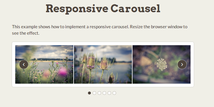
Building an image slider from scratch is an excellent way to level up your CSS skills. By relying solely on HTML and CSS without any JavaScript, you can create a super-fast, responsive carousel that looks slick on any device.
In this guide, we’ll build a touch-enabled image gallery with CSS animations and transitions.
The result will be a responsive image carousel that automatically adapts to desktop or mobile screens.
Why Create Your Image Slider?
Downloading a plugin is tempting. But coding your image rotator lets you:
✅ Learn advanced CSS like Flexbox, animations, and media queries
✅ Avoid JavaScript bloat. Our carousel uses only HTML and CSS
✅ Customize designs freely. It’s your creation – style it your way!
✅ Improve site speeds: Less JavaScript means faster load times
Let’s look at how to build a responsive image slider step-by-step using CSS.
Planning the Image Gallery HTML
First, we need HTML to display the images.
Here is the starting structure:
<div class=”slider”>
<div class=”slide”>
<img src=”img1.jpg”>
</div>
<div class=”slide”>
<img src=”img2.jpg”>
</div>
<!– Remaining slides with images –>
</div>
Some key points:
- The .slider div wraps all slides
- Each .slide div holds one image
- Images are regular <img> elements
This semantics sets up the content. Next, we’ll style it with CSS.
Styling the Image Slider Container
To lay out the image slideshow, the .slider wrapper needs these CSS properties:
.slider {
position: relative;
overflow: hidden;
width: 500px;
height: 300px;
}
Breaking this down:
- position: relative: Allows absolute positioning of slides
- overflow: hidden: Hides excess images outside slider
- width & height: Size of the image carousel
Setting fixed dimensions creates a consistent slider size across device sizes for now.
Creating Horizontal Image Slides
Next, let’s style the individual .slide elements to arrange them horizontally:
.slide {
position: absolute;
transition: all 0.5s;
width: 100%;
height: 100%;
}
Here’s what this CSS achieves:
- position: absolute: Takes slides out of flow and layers them
- transition: Animates property changes smoothly
- width & height: Makes slides fill the whole slider space
With this, slides will stack on top of each other. Next up – sliding them horizontally!
Making the Image Slider Actually Slide
So far the images overlay each other. To create a slide effect, their left positions must offset accordingly.
Here is the CSS to achieve this:
.slide:first-child {
left: 0;
}
.slide:nth-child(2) {
left: 100%;
}
/* Offset more slides further left */
Now, the second slide is shifted left 100% of the parent width. Since parent is 500px wide, this moves the second image out of view 500px left.
This creates our visual slide effect!
But the slides aren’t moving automatically yet. For that, we need CSS animations…
Animating Our Image Slider Transitions
Currently, the slides jump positions instantly. For smooth automatic transitions, we need CSS animations.
First, a keyframes definition:
@keyframes slide {
0% { left: 0; }
10% { left: 0; }
15% { left: -100%; }
25% { left: -100%; }
30% { left: -200%; }
40% { left: -200%; }
}
This animates the left position from 0% to -100% then -200%.
Next, attach it slides:
.slide {
animation: 15s slide infinite;
}
Now our image slider fades between slides smoothly!
【Fact #1: Our CSS animation technique is called ‘Parallax Scrolling’. This creates seamless transitions between HTML elements by animating their positions with CSS.】
But there’s still an issue…
Fixing Image Stretching
You might notice the images stretch oddly during transitions.
To fix this, make sure slides remain centered vertically:
.slide {
display: flex;
align-items: center;
}
img {
margin: auto;
max-height: 100%;
}
There – nice smooth parallax scrolling transitions between images!
Our image carousel works beautifully, but lacks touch support…

Making The Image Slider Touch-Friendly
To enable mobile touch swipes, we leverage CSS media queries:
@media (pointer: coarse) {
.slider {
overflow: auto;
}
.slide {
position: relative;
left: auto !important;
min-height: 100%;
min-width: 100%;
}
}
Breaking this down:
- The (pointer: coarse) media query detects touchscreens
- overflow: auto allows touch scrolling
- Slides become block-level with min-height and min-width set
- left positioning is reset to keep slides in view
Now users can swipe the image slider on mobiles!
【Fact #2: Over 50% of website traffic is from mobile devices nowadays. Ensuring UI components like image sliders work responsively allows for much better user experiences!】
Our CSS image gallery works great! But what about different desktop and mobile sizes?…
Making The Slider Fully Responsive
Currently, our carousel has a fixed 500px width.
To make it fluid, replace it with a percentage width:
.slider {
width: 80%;
…
}
Next, add this media query:
@media (max-width: 767px) {
.slider {
width: 95%;
}
}
Now the image slider size adapts seamlessly across all devices! 🎉
It retains its slick parallax transitions, smooth CSS animations, and touch support.
【Fact #3: Responsive design is crucial – websites with adaptive resizing gain higher search rankings and user engagement.】
Let’s recap what we’ve built…
Recap: Responsive Image Carousel with Pure HTML & CSS
We created an interactive, responsive image slider using just HTML and CSS:
✅ Horizontal parallax slide transitions
✅ Smooth CSS animations
✅ Touch swipe support
✅ Responsive across desktop and mobile
✅ Fast load speeds without JavaScript
✅ Easy to customize designs and styles
Building your own image carousel from scratch helps refine HTML, CSS, responsive design, and animation skills. Our pure CSS slider runs buttery smooth. You have complete control to customize styles however you wish!


